/ Project
EAP Zamorano Rebranding
Brand strategy
Brand expression
Brand activation / packaging
Application
The Zamorano Pan-American Agricultural School, founded in 1942, entrusted us with the task of subtly redesigning the visual identity of its brand without losing the tradition and prestige that characterizes it, refocusing the essence of its brand and giving more value to its packaging, highlighting the quality of its products.
Solution
How can you modernize a historic brand without losing its essence? We'll tell you how we made it happen for the Zamorano Pan-American Agricultural School.
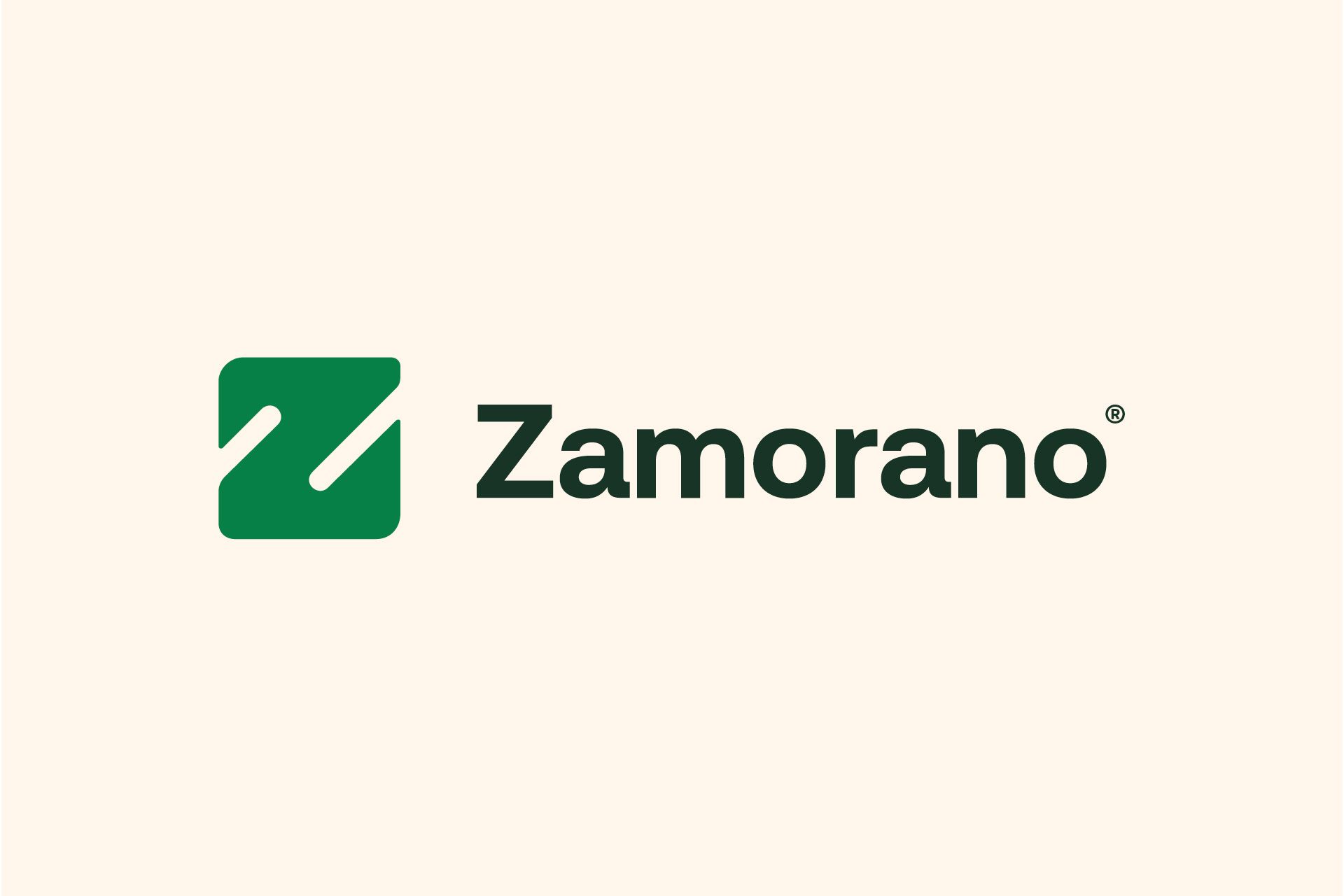
We designed a unified, monolithic branding system that elegantly highlights the iconic "Z" in each of its applications, creating visual consistency throughout the institution.
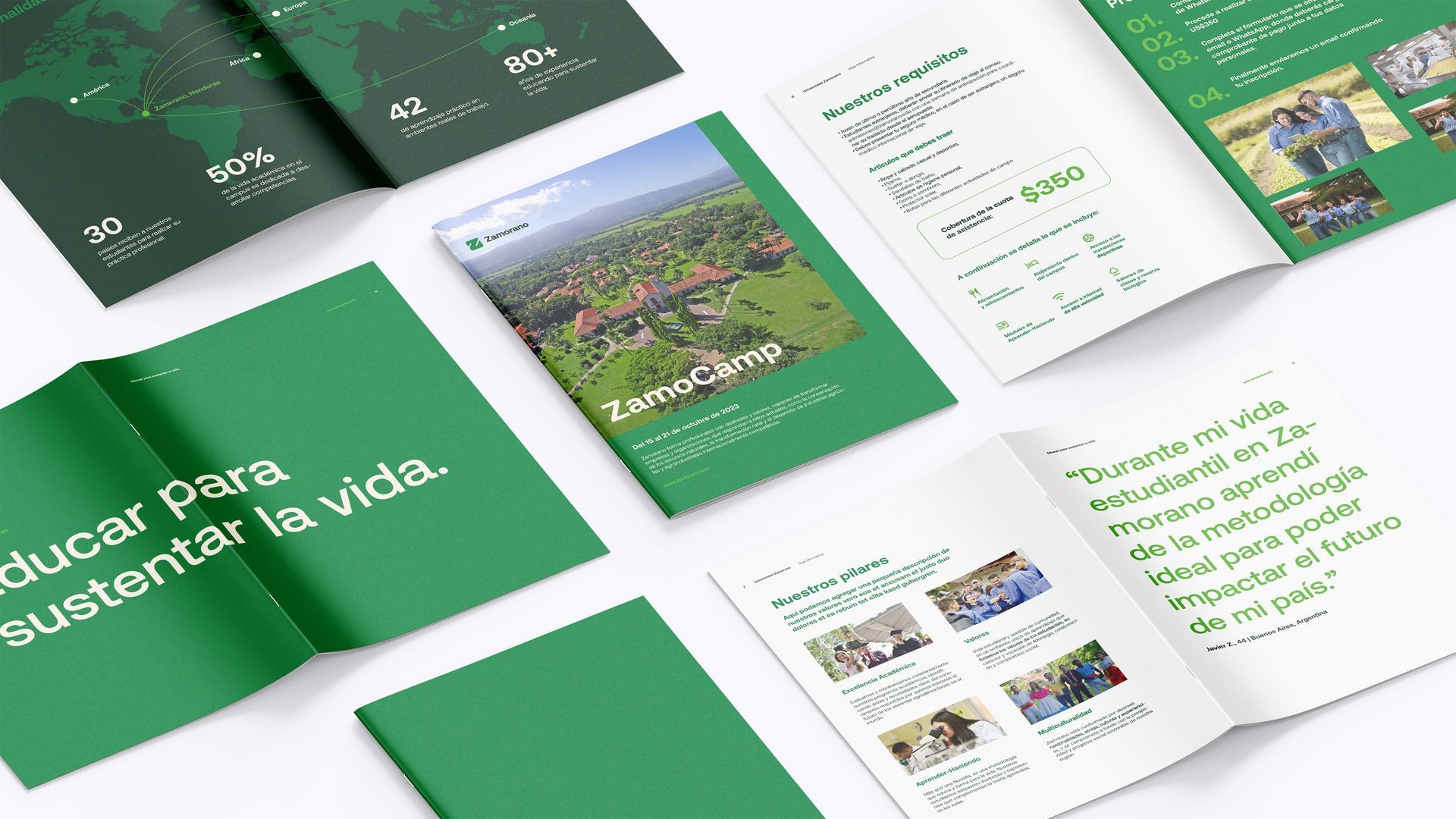
We created strategic variations to clearly differentiate their commercial, educational, and product areas, complemented by a fresh color palette inspired by natural green tones that facilitate reading and strengthen visual recognition. All of this is supported by a robust system of visual grids that ensure harmony and professionalism in each photograph and artwork.
Slide title
Write your caption hereButton
Slide title
Write your caption hereButton
Slide title
Write your caption hereButton
Slide title
Write your caption hereButton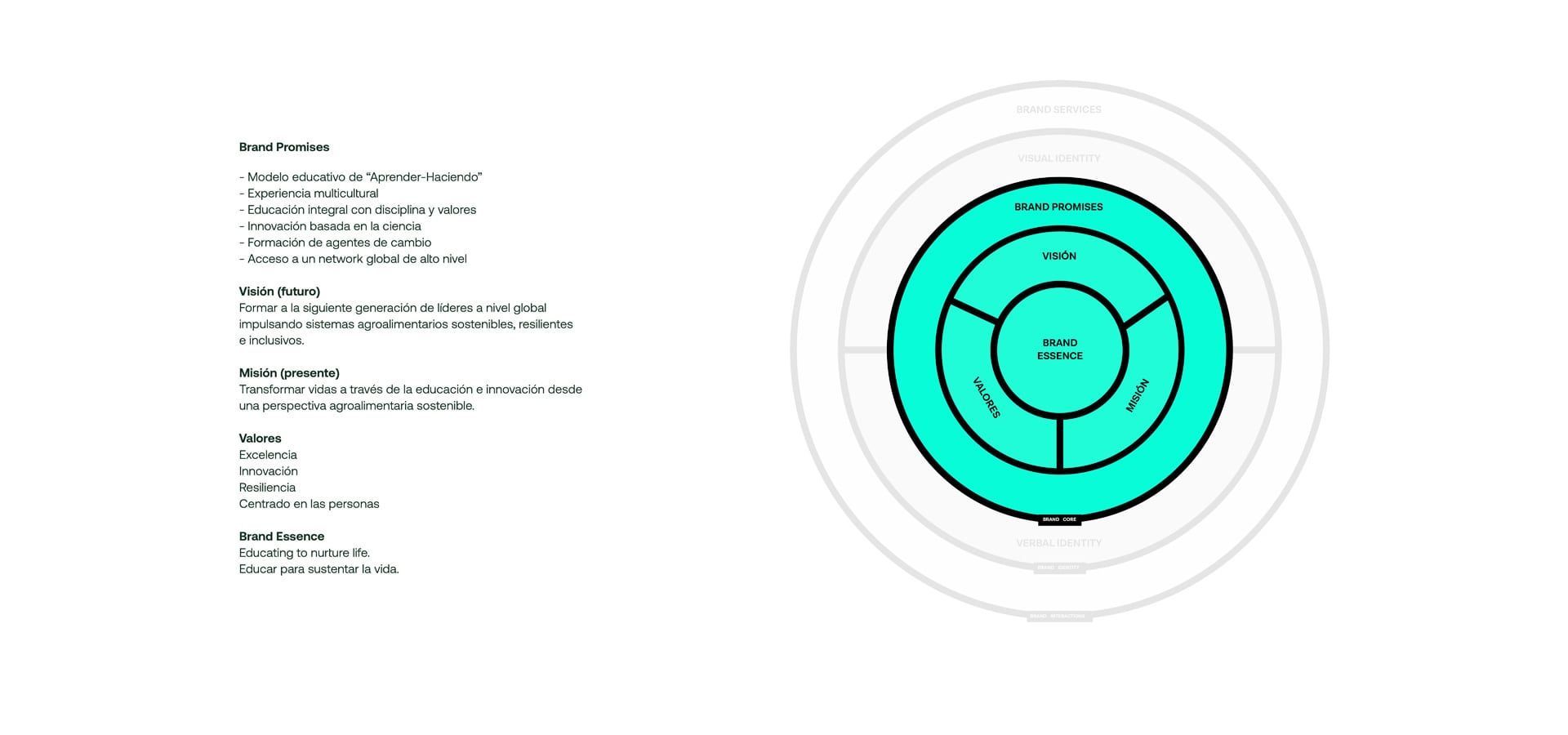
Slide title
Write your caption hereButton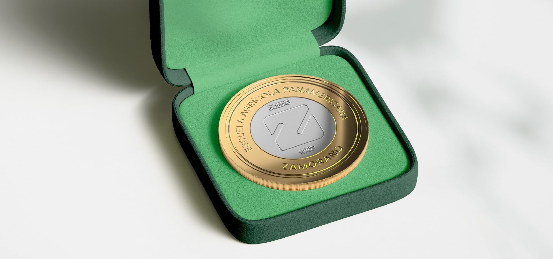
Slide title
Write your caption hereButton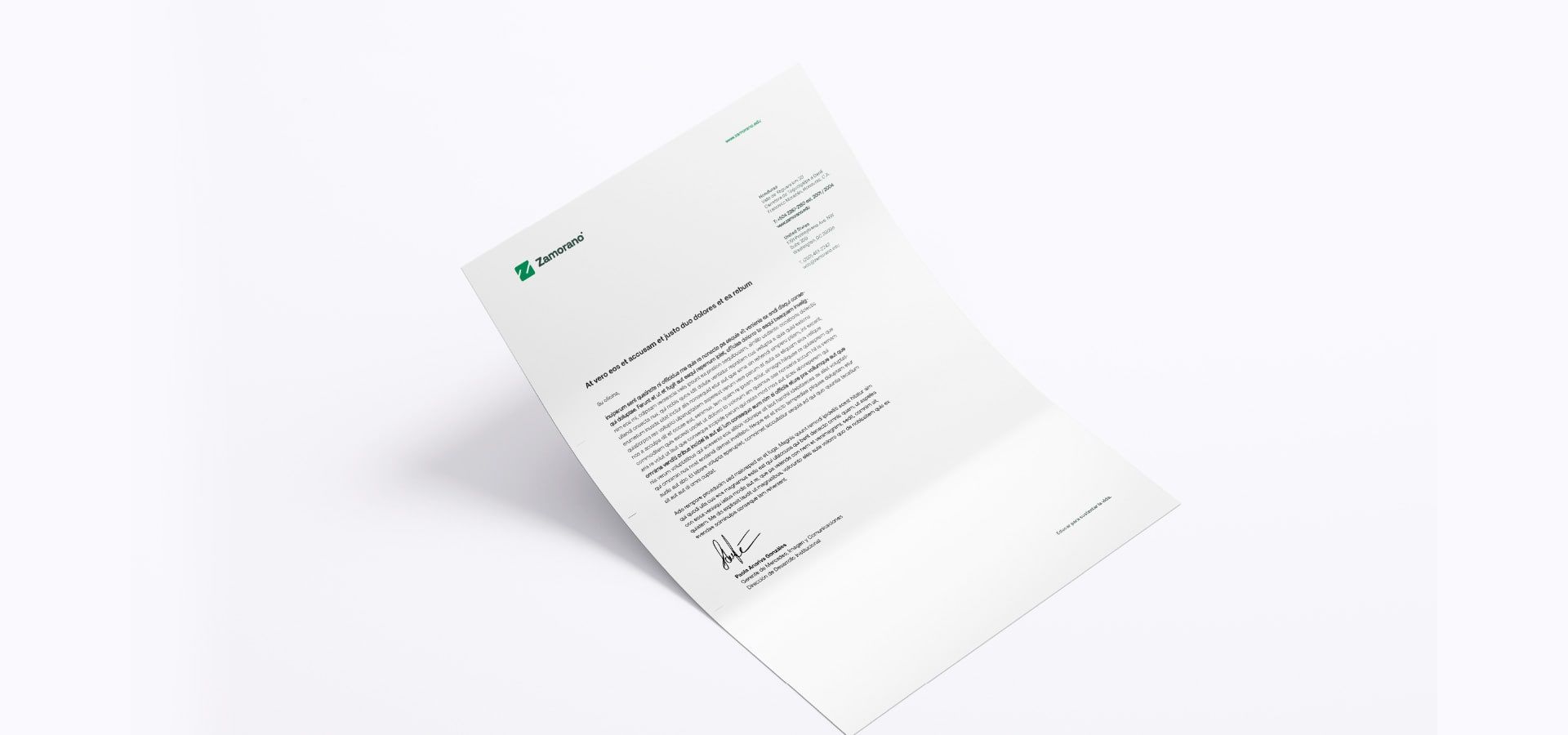
Slide title
Write your caption hereButton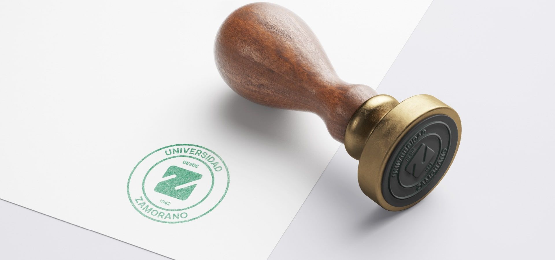
Slide title
Write your caption hereButton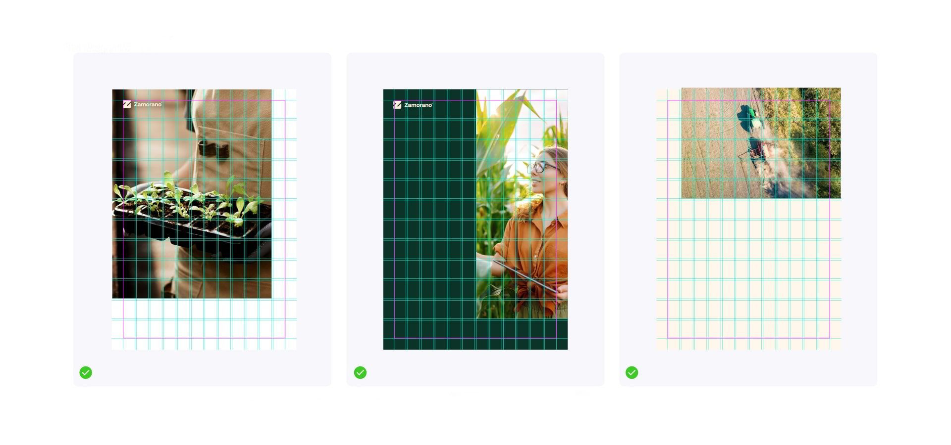
Slide title
Write your caption hereButton

Every branding project is unique and deserves special attention. In the case of the Zamorano rebranding, our team began by delving into the institution's history and values, understanding the sensitivity surrounding its iconic "Z."
We worked closely with the internal team and held creative workshops where we explored different visual solutions that would modernize the brand without breaking the emotional connection with its long-standing audience. Through sketches, color tests, and strategic variations, we arrived at a design that reflected freshness and evolution while preserving the brand's essence, prestige, and legacy.
This collaborative and empathetic method allowed us to generate a solid visual proposal and anticipate the possible reactions of different audiences, thus ensuring a natural acceptance of the change.